Industry
Telecommunications
Client
Kyivstar
MyKyivstar - UX research

Problem
Kyivstar is one of the leading telecommunications operators in Ukraine. They developed their mobile app MyKyivstar to enhance user experience with 10M+ downloads.
In 2022 the company started initiated research on the application feature "To add number". However, with the unexpected outbreak of war, they stopped working on it. In 2024, my team and I were tasked with resuming their research.

Discover phase
In the Discover phase, our primary goal was to gain a deep understanding of the stakeholders needs, as well as the perspectives and experiences of potential users regarding the "To add number" feature in the app. We conducted thorough research and engagement activities to achieve this goal.
Brief
First of all, we scheduled a meeting with Kyivstar's Product Designer, Dasha, and Product Owner, Oksana. Our main focus was to determine the specific problem we would solve.
Feeling the significance of the moment, I made a effort to listen attentively and record all the details from the clients.
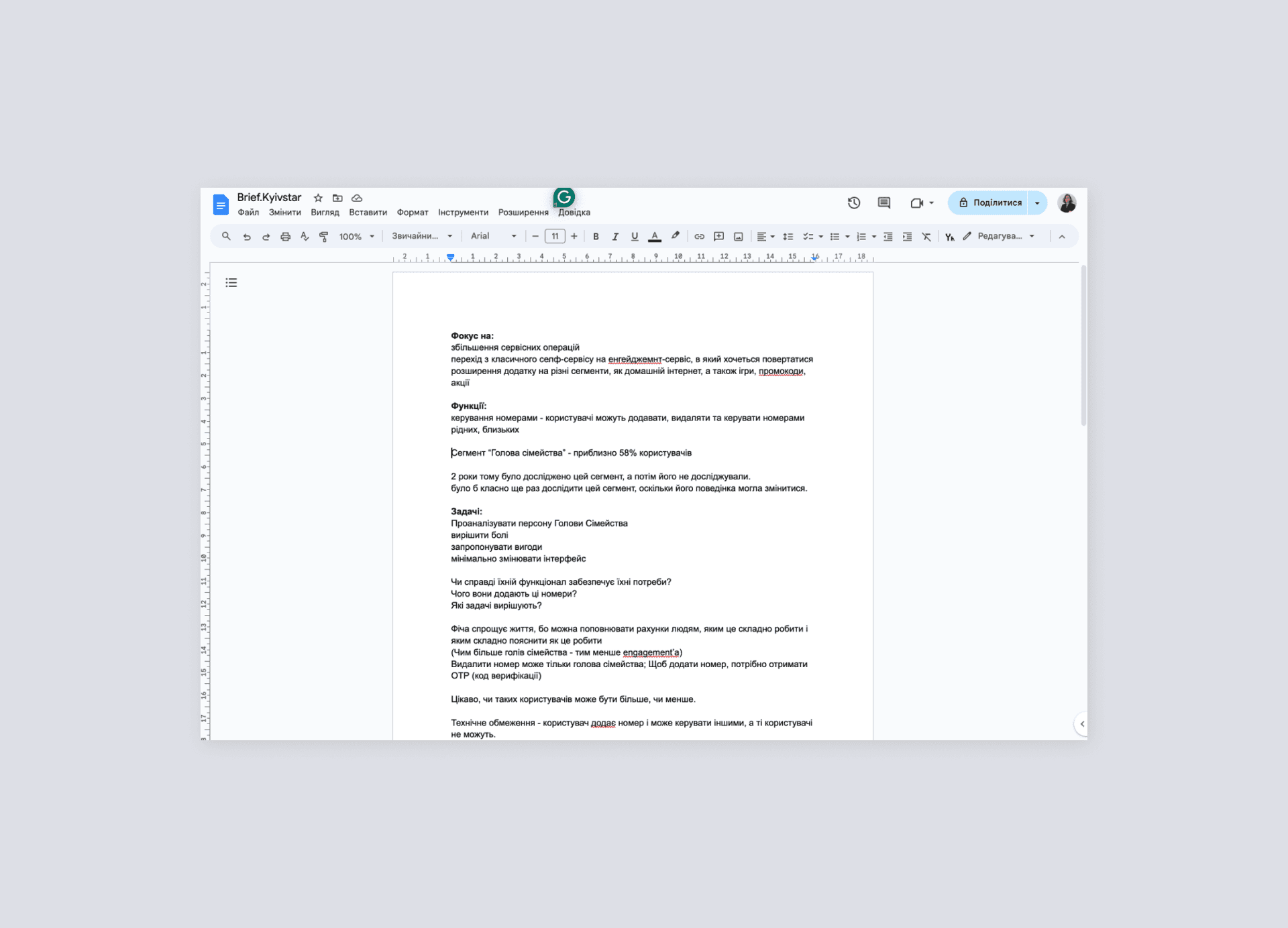
After the brief, we identified customer pain points and fixed our main tasks:
Analysis of the "Head of the Family" persona
Determine the relevance of multi-account
Determine the usability a multi-account
Offer ideas for attracting customers to multi-account.
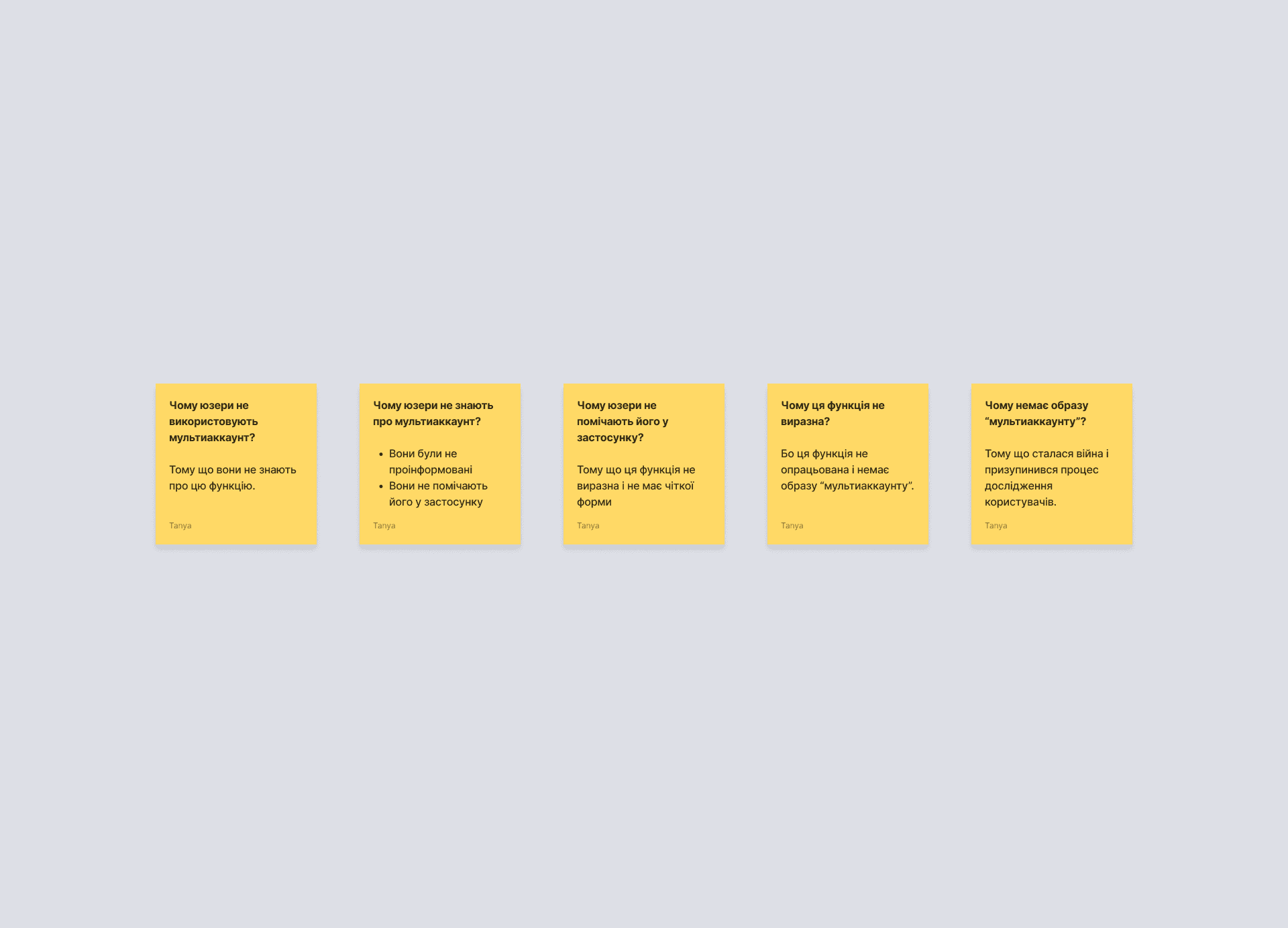
We used a problem-solving method “5 Why” to determine the root cause of problem by successively asking the question "Why?". This method helped us identify the primary reason why customers wanted us to explore the multi-account feature.
In-depth interviews
The next step was creating screeners for a survey with the definite purpose of filtering out the specific type of respondents I need from the whole. Our goal was users who interacted with the "add number" feature. Both positive and negative experiences were equally important to us. My team and I had meeting and we discussed for a long time which questions should be asked.
Each member of my team had to conduct 3-4 interviews. Together, we could have 15 interviews. And after getting insights from all the interviews, we can reach saturation point, meaning the moment when conducting further interviews wouldn't provide new information.
I conducted 3 interviews:


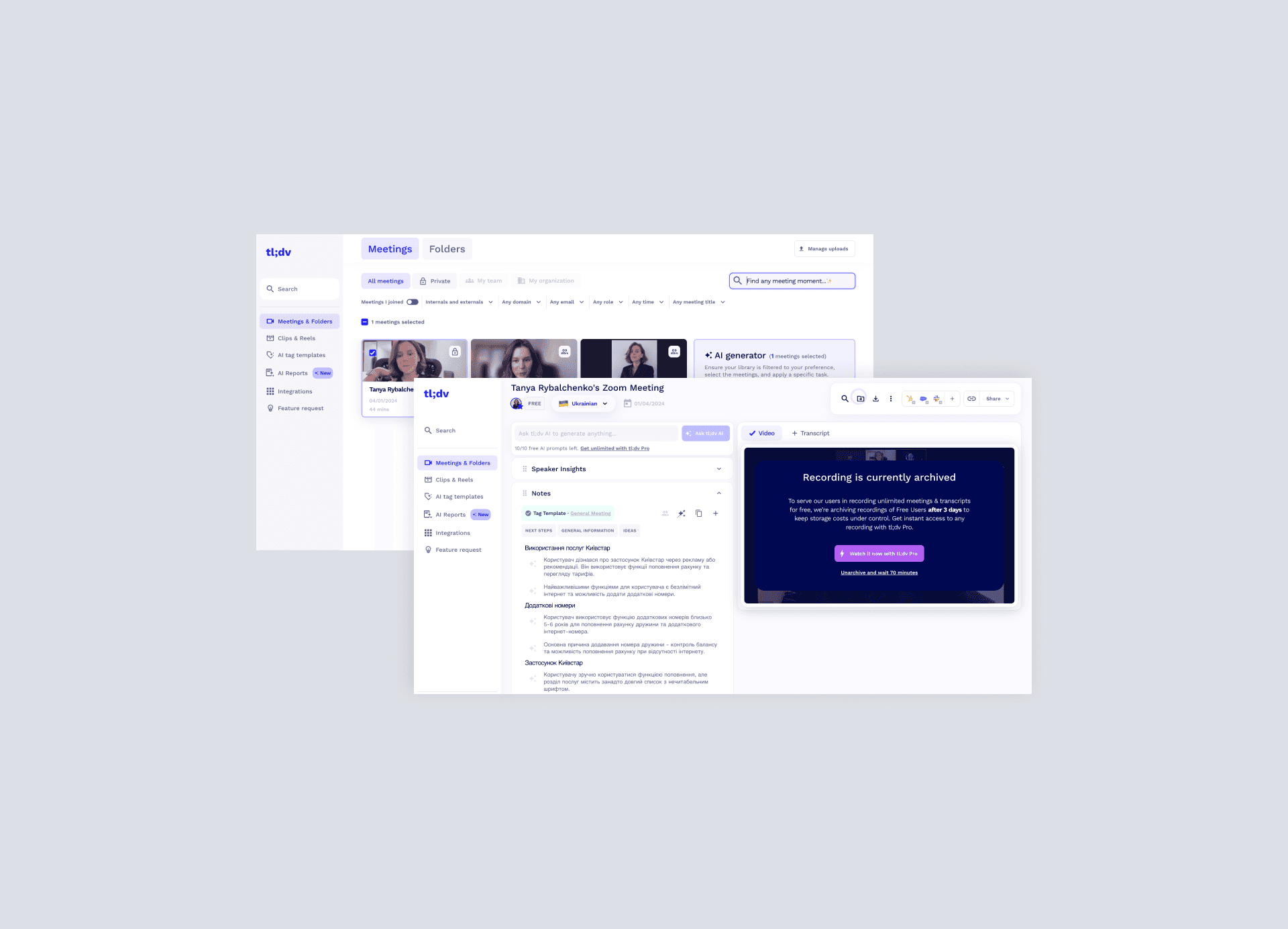
Transcription
I used the platform TL;DV during each interview for get value from meetings. I was shocked how quickly our conversation was transcribed. Modern technologies are amazing!
Define phase
In the Define stage, our focus is on synthesizing the insights gathered during the Discover phase to define clear objectives and solutions.
Insights
In order to define insights, we decided to write all our interviews on stickers in FigJam and mark in red - pain points, in green - delights, in blue - suggested solutions, in grey - general observations.


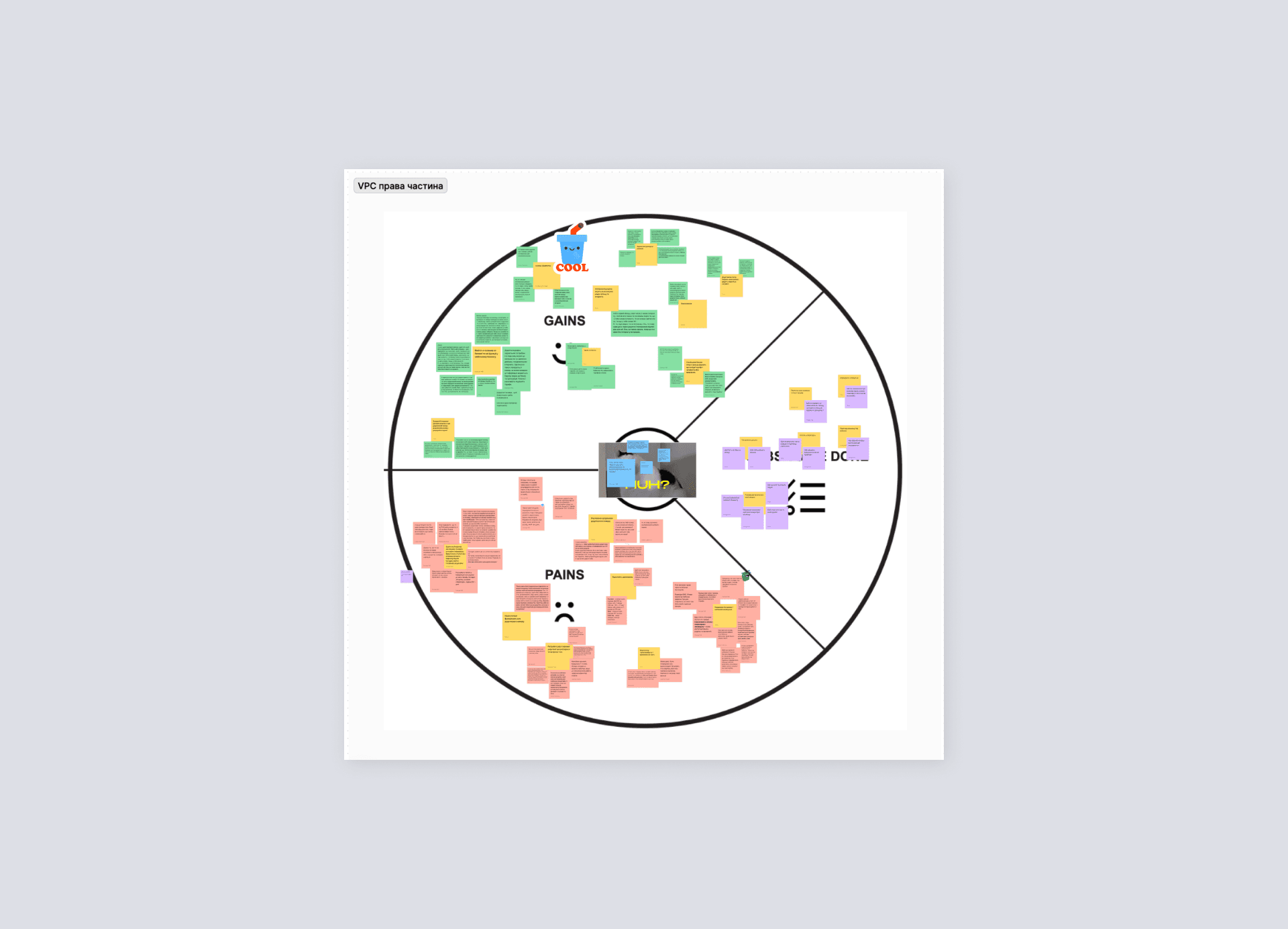
VPC (analysis)
During the VPC analysis stage, our focus is on dissecting and refining the value proposition of the "Add Number" feature within the Kyivstar application. This involves a comprehensive examination of both the customer segment and the product or service offering, aiming to align them effectively and create maximum value for users.
Based on our insights from interviews, we started to separate gains, pains and user’s jobs. Pains from user interviews were repeated, so we grouped them for better visual perception and understanding.
Develop phase
Leveraging the insights gained during the Discover and Define stages, we engage in ideation, brainstorming, and concept development to generate solutions that address the identified problems and opportunities.
VPC (brainstorming HMW)
The VPC consists of two parts: the left side is the Value Map, and the right side is the Customer Profile. We started to fill the value map. Similar to the circle, the product-related section is divided into three parts. Our focus was made on features, functionality, and benefits it can offer to not only attract customers but also meet their requirements from the right part.

We used a How might we (HMW) question to generate lots of creative ideas. We generated HMWs that are specific to what we’ve learned. It is important to create questions that can result in ideas that address the root problems and the insights you uncovered.
For example, we had insight: Users didn’t see multi-account.
And we didn’t ask: How might we improve the user experience of the multi-account?
We asked: How might we make button “multi-account” more noticeable?
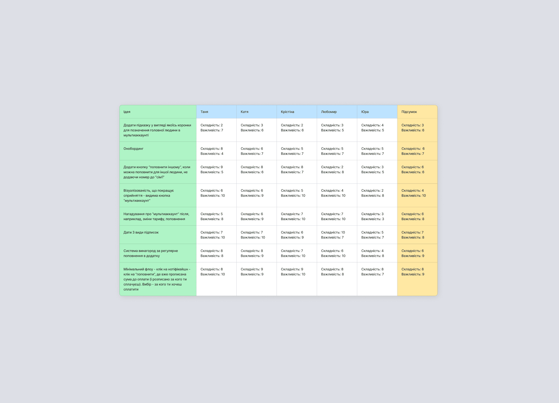
Prioritization
To ensure the efficient use of team resources and maximize user benefits, I conducted a prioritization of ideas based on their complexity and importance. By evaluating each idea on a scale of complexity and importance, we were able to identify which ideas should be implemented first.
We took into account the opinions of all team members, which allowed us to focus on the most critical tasks while maintaining a balance between user impact and technical feasibility. This approach ultimately enabled us to effectively implement changes in the MyKyivstar app.
Deliver phase
At this stage, we began turning our hypotheses into actual designs and testing them through in-depth interviews with users.
Hypothesis 1
Insight from Interviews: It was observed that users often do not notice the function to add a phone number due to its lack of visibility.
Hypothesis: If we make the button for adding a phone number more prominent, users will have an easier time recognizing how to perform this action.

Result: When asked why they decided to click on the "+" button, a user responded that adding a number seemed like a straightforward action, and the plus sign was the most logical place to do it. They mentioned that hiding this function under something less obvious, like three dots, might confuse users. The plus symbol was immediately understood as "adding," similar to what they learned in school, making it intuitive and easy to use.
Hypothesis 2
Insight from Interviews: It was discovered that many users either forget or are unaware that they can add additional phone numbers to their account.
Hypothesis: We hypothesized that by adding a reminder on the success screen, which appears after users complete a transaction like topping up their balance or changing their plan, users might become more interested in this feature. Since the reminder is placed in a relevant context (when they've just managed their account), it might prompt them to explore similar options for other numbers, such as those of family members. We believe that if this approach leads to an increase in the number of added numbers, it will confirm that the reminder is effective.

Result: A user clicked the banner because they were already paying their own bill and needed to top up their sister’s account. The banner successfully guided them to complete the additional payment, indicating that it effectively captured their attention and served its purpose.
Hypothesis 3
Insight from Interviews: It was found that users often do not top up their accounts through the "Kyivstar" app, but instead, use third-party apps.
Hypothesis: The hypothesis was that if we added a push notification reminding users to top up their balance, and they could directly access the top-up page by clicking on the notification, it would make the process easier and faster. This would encourage users to top up their accounts within the app in just two clicks.

Result: Users responded positively to the notification feature. They found it convenient and intuitive, appreciating the timely reminder to top up their balance. The feedback highlighted that the notification was useful and easy to understand, enhancing their experience by making the top-up process more straightforward and accessible.
Hypothesis 4
Insight from Interviews: It was found that people often don’t understand how convenient it is to manage and control family subscription plans to save on the family budget.
Hypothesis: The hypothesis was that by adding a dedicated screen with a list of available subscriptions, it would be easier for users to consider opting for a family plan to save on communication costs. Additionally, this could serve as a trigger to create a multi-account setup, encouraging users to add numbers of family members or other important people.

Result: Users responded positively to the family subscription feature, finding it similar to services they already use, like YouTube and Spotify. They were open to adding their family to the plan, depending on the terms. The feature was rated 5 out of 5 for convenience and ease of use.
Summary
The new product features are currently under development. This means they are still being designed and built, and we haven't implemented them yet. Therefore, there aren't any results available to share at this time.
Over 20 hours
were spent to transcribe and synthesize data
8 hypotheses
were generated to solve problem
4 users
were interviewed