Industry
Education
Client
Odesa National Maritime University
Redesign of ONMU website

Problem
Odesa National Maritime University - is a Ukrainian university in Odesa. Their website was creating in 2000's. The website is too old and complicated in its navigation. Students can't find schedule of their lessons, information about teachers, and the last news of the university. Applicants can't find the necessary list of documents for admission, information about specialties and faculties.
My objective is to find a way to design an easier user flow and intuitive interface. I had to conduct research, generate hypotheses and implement a solution.

Research
The client's budget didn’t include in-depth interviews with necessary respondents, so I focused on сompetitive research. There are difficulties in finding truly valuable examples of university websites in Ukraine.
A lot of websites have same problems - confusing navigation, long and unclear user flow, a large amount of text, outdated visuals. So I was surfing the web and searching for websites of the world's leading universities. Also Ukrainian non-state educational platforms have modern solutions and usability of their websites.
Competitors
Sites of competitors that I analyzed to identify Points of parity (PoP) and Points of difference (PoD) to determine which elements are fundamentally similar in terms of efficiency and functionality, and which are fundamentally different:


But If I could conduct in-depth interviews, first of all, I would identify two main categories of the university's target audience who can share their user experience. The website is used not only by students, but also by professors. The obvious approach would be to triangulate two points of view to identify user issues and understand which features are the most difficult in using the website.
Next step would be creating screeners for a survey with the definite purpose of filtering out the specific type of respondents I need from the whole.
After that, I would post a survey on the university's social media and reach out to students, asking them to share it on Telegram groups.
In in-depth interviews I would ask them this questions:
Solution
After сompetitive research and identifying pains users may face during using the website, I started thinking about how might I do it better and working on redesign.
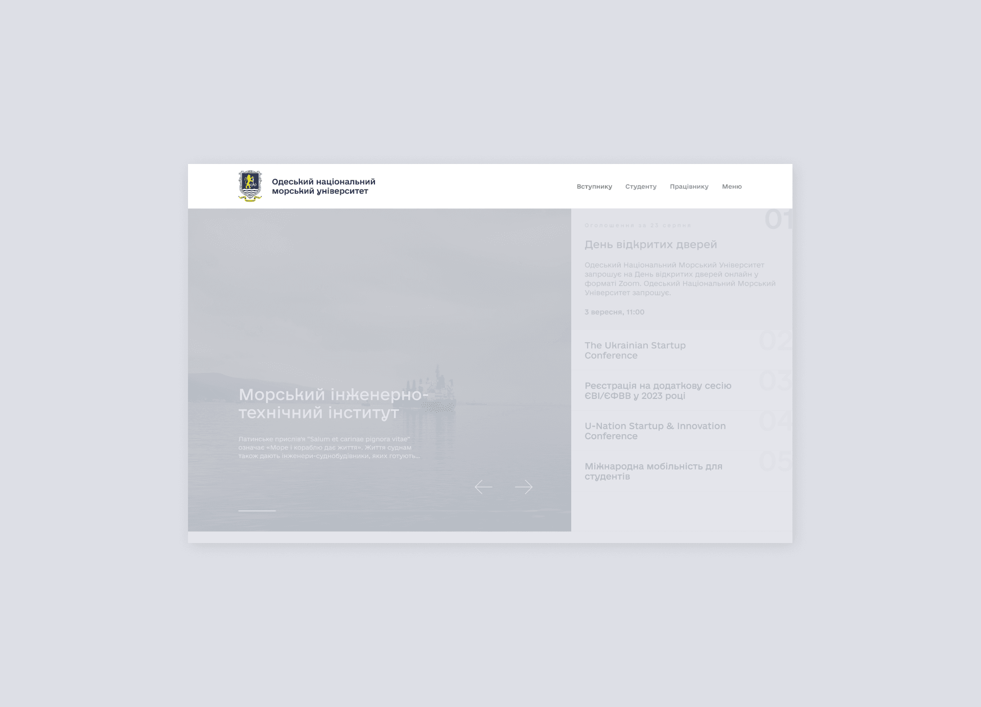
Main page
The website of the university has different target audiences, such as students, applicants, and professors.
Applicants often use the website for find out all information about their admission, students and professors - for a schedule of lessons.


For good website’s navigation and good orientation user shouldn’t think a lot. Previous website’s interface has a lot of visual noise and unusual structure.
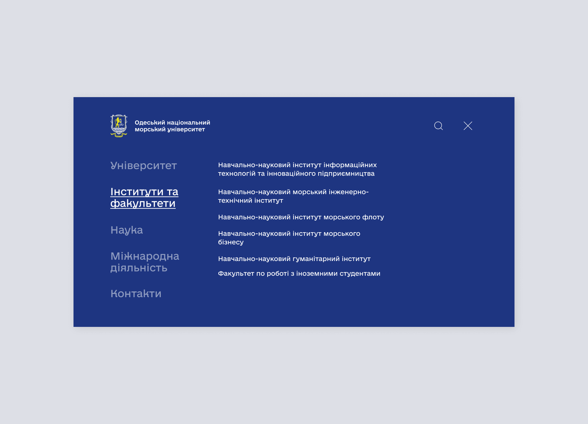
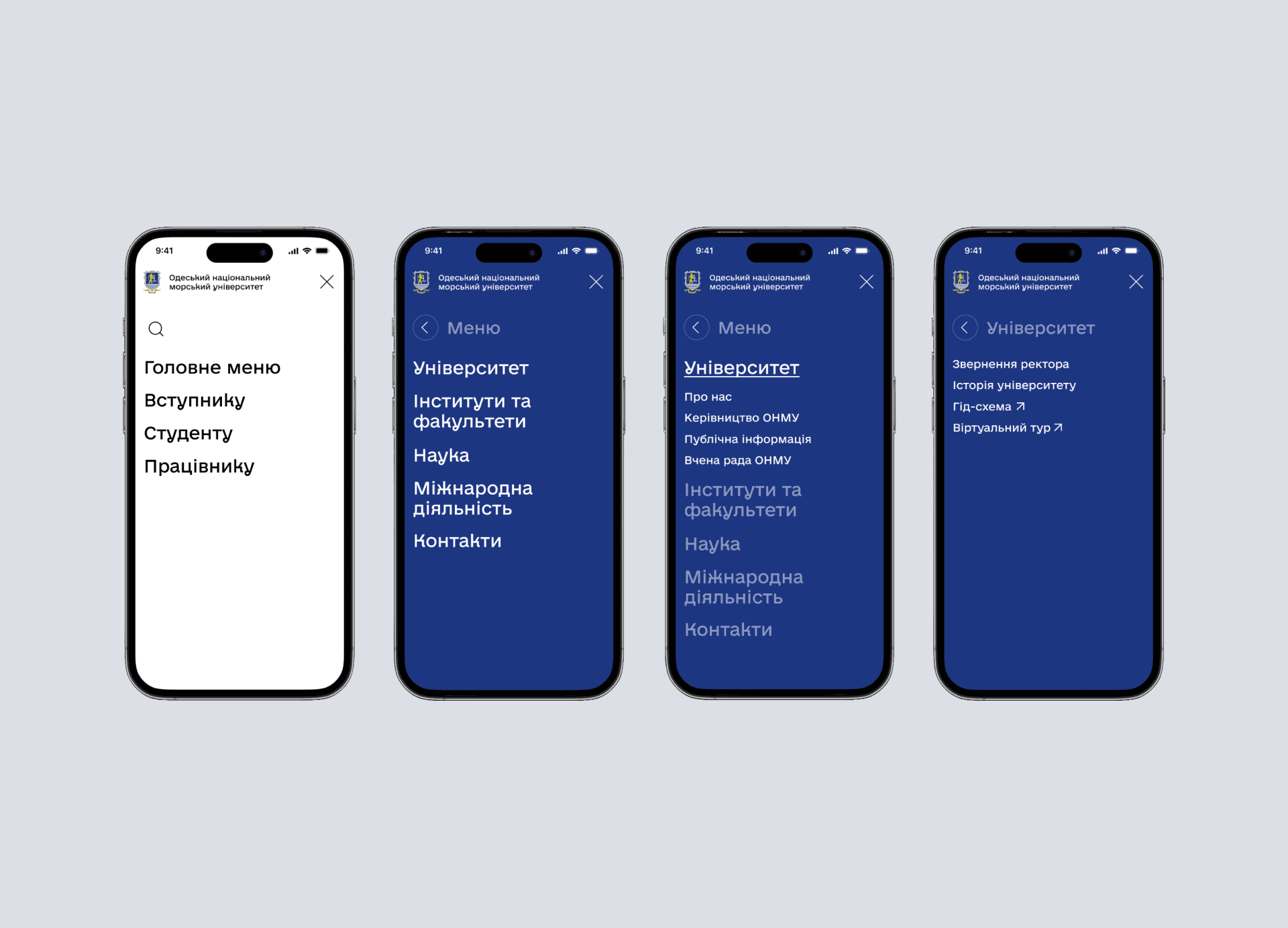
I based on the Jakob's Law, that “Users spend most of their time on other websites, so they expect your site to work like all the other sites they already know”. So I decided to design a familiar structure for people: the header with university’s logo and 4 tabs “For students”, “For applicants”, “For professors”, “Main menu”.
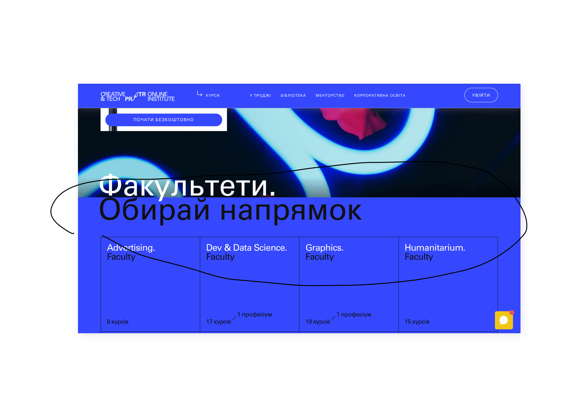
The university website should sell itself, so it's important to make the specialty selection block on the main page.
This way, applicants and their parents can easily find information and pick the best option. Like Projector do it:

The clients insisted that a block with the edition should be displayed on the website.
I wanted to minimize the amount of scrolling users must perform to reach their desired content. So here I decided to come up with horizontal-scroll. For clearly indicate the scrolling feature, I created arrow-buttons, scroll bar and button “see all”. Additionally, I developed book previews to prevent users from having to open each book individually.

I wanted to keep the navigation menu simple and concise, avoiding overcrowding with too many options.
Based on Miller’s Law, that the average human can hold about 7 (plus or minus 2) items in their working memory at a time, I tried to limit the number of menu categories for improve users comprehension and retention.
News page
The news page had large volumes of text and didn’t provide an opportunity to find the desired news very quickly.
To enhance the user experience, I implemented a search function and categorized the news by topic, allowing users to easily navigate through the news page and find the information they're looking for.

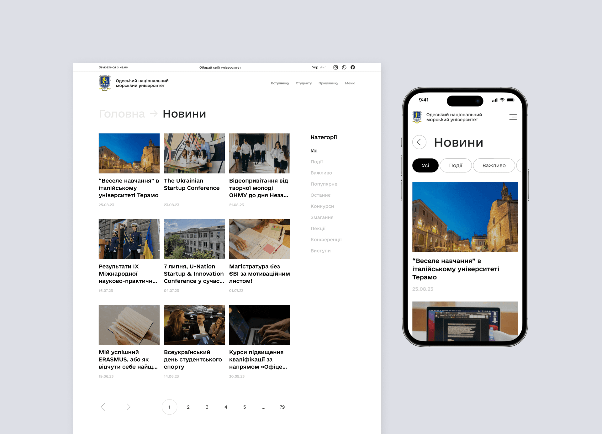
A news page often contains a lot of text, and it is difficult for people to pay attention to long texts. People scan information, not read it.
Nielsen Norman Group discovered with eye tracking visualizations that users often read Web pages in an F-shaped pattern: two horizontal stripes followed by a vertical stripe. To accommodate this, I structured the news page content in an F-pattern layout. This approach aligns with the natural reading behavior of users and helps them to quickly scan and absorb information.

I used large, bold headlines and broke up large blocks of text into smaller, easily digestible paragraphs. This also included using bullet points or numbered lists to highlight key information, and pull quotes to draw attention to important points.
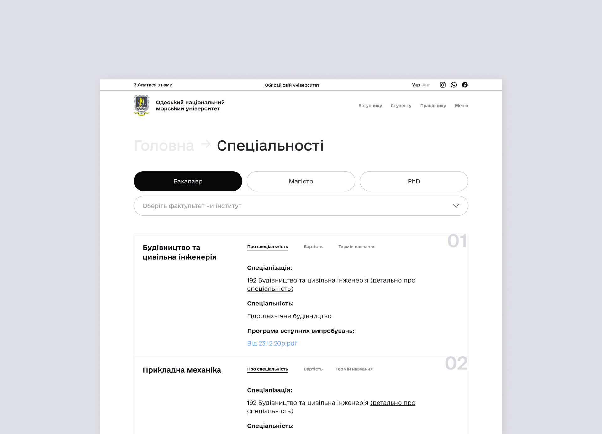
The specialties page
The previous design of the specialties page was cluttered and confusing with too much information presented all at once.
To improve this, I implemented a tab system, separating the specialties into 'Bachelor', 'Master', and 'PhD' views. This allows users to choose the view that best suits their needs, reducing information overload.

Cards with information about specialties I decided to design in a simple and clear way. I used a large, bold headline for the name of the specialty, and near I placed the most important information for the applicant, such as the form of education, the term of study, and the cost.
This way, the page does not seem overloaded with information and it is easier for users to perceive it.