Industry
Beauty&health
Client
Pet project
Deal - appointments mobile app
Project overview
Deal is a mobile app designed to facilitate the booking and management of appointments between users and businesses.
Deal’s mission is clear: to help people get appointments whatever they want, whenever they want, wherever they want. As an appointments mobile app, Deal can offer a lot of advantages to both businesses and users - convenience, 24/7 availability, automated confirmation. In this case study, I will show you the design process step by step.

Discover phase
During the discover phase of developing the appointment app, the focus is on conducting a competitive and feature analysis of the appointment apps in the market. Then, I surveyed and interviewed potential users to gain insight into their motivation and pain points.
Competitive Research

In-depth Interviews with users
Define Phase
In the second step of the design process, I will be creating a persona, an empathy map, a customer journey map, and finally coming up with a problem statement.
Provisional Personas

Anna is a 27-year-old professional working in a demanding corporate job.
She leads a busy and fast-paced lifestyle, often juggling multiple responsibilities.
Empathy map

Customer Journey Map
By mapping Anna's beauty salon appointment journey, I gain valuable insights into her needs, emotions, and pain points. These insights can guide the development of an appointment app that caters to Anna's preferences and delivers an exceptional user experience, ultimately leading to increased customer satisfaction and loyalty.

Anna's pain points highlight specific areas where she faces challenges and frustrations during her beauty salon appointment journey.
Addressing these pain points with solutions such as a user-friendly appointment app, real-time availability updates, automated reminders, and clear communication can greatly improve Anna's overall experience and satisfaction with the appointment process.
Problem Statement
After research, I can deduce that people who want to get a beauty salon appointment often face difficulties in finding available time slots, lack of convenience in scheduling appointments, and limited access to up-to-date information about services and availability.
Design Phase
In this step of the design process, I came up with solutions and created an information architecture. Followed by that are paper sketches, mid-fi wireframes, usability testing, and a UI kit.
Information Architecture
After all the research, I already saw in my head what the app should be, and the architecture of the future app was born. In the structure, I described what screens and functions should be on the app, relying on research.

User-flow
I created main user-flow that users can go trought:
1) Sign Up + Add a New Appointment

Sketches
Alongside the information architecture, I quickly sketched my ideas on paper, keeping in mind the user’s pain points and motivations. It is needed to test the UX and understand whether there are any problems. For example, if you forgot to add a button, it will be easier to add it during the sketches stage than when the whole design is already done.

Mid-Fidelity Wireframes
Using Figma, I first started by creating mid-fidelity wireframes based on my sketches. I started by laying out all the screens I needed to design for the existing user flow.

UI Kit
When the screens were designed, I started thinking about the visual concept. I asked myself: What kind of feeling do I want users to experience while using Deal?
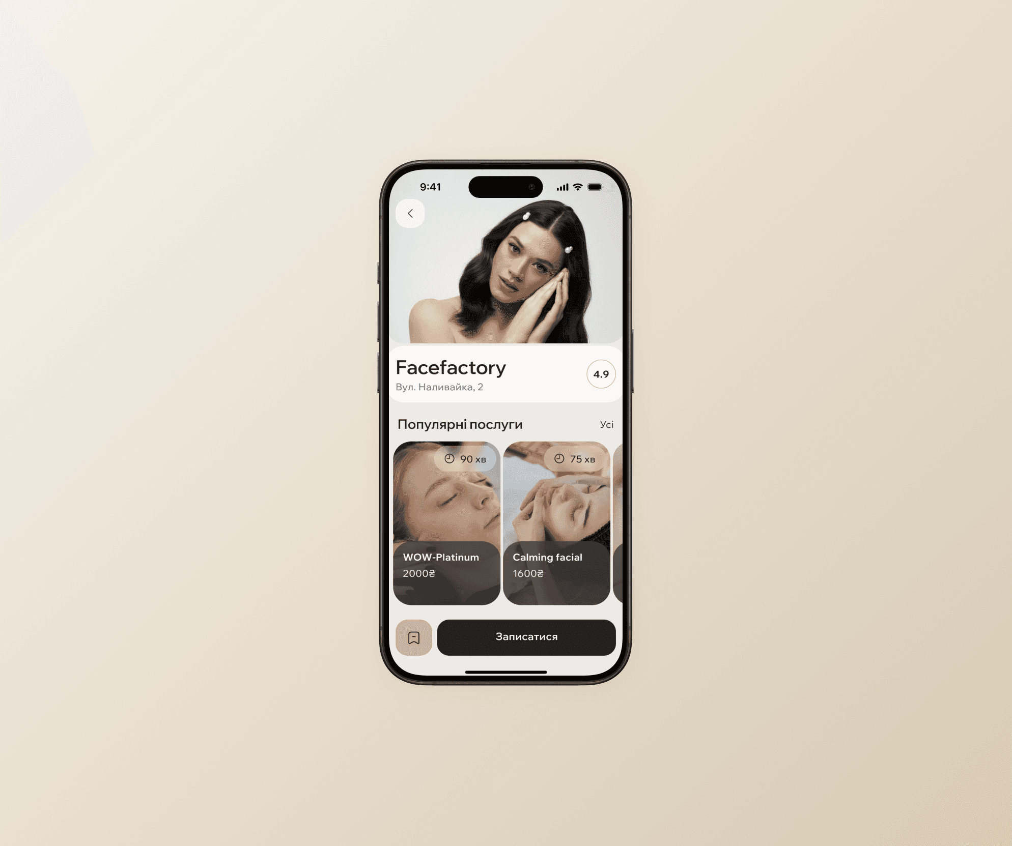
The color terracotta is often associated with a warm, earthy, and natural aesthetic in beauty apps and various other design contexts. Terracotta can add a touch of elegance to the app's design when paired with complementary colors and textures, creating a balance between sophistication and approachability. So I diceded to choose as an accent color and three earthy tones associated with natural beauty products and organic ingredients, conveying a sense of purity and authenticity.
I used a Wix Madefor Display font so it combines wide geometric proportions, clean curves, and flaring grotesk terminals.

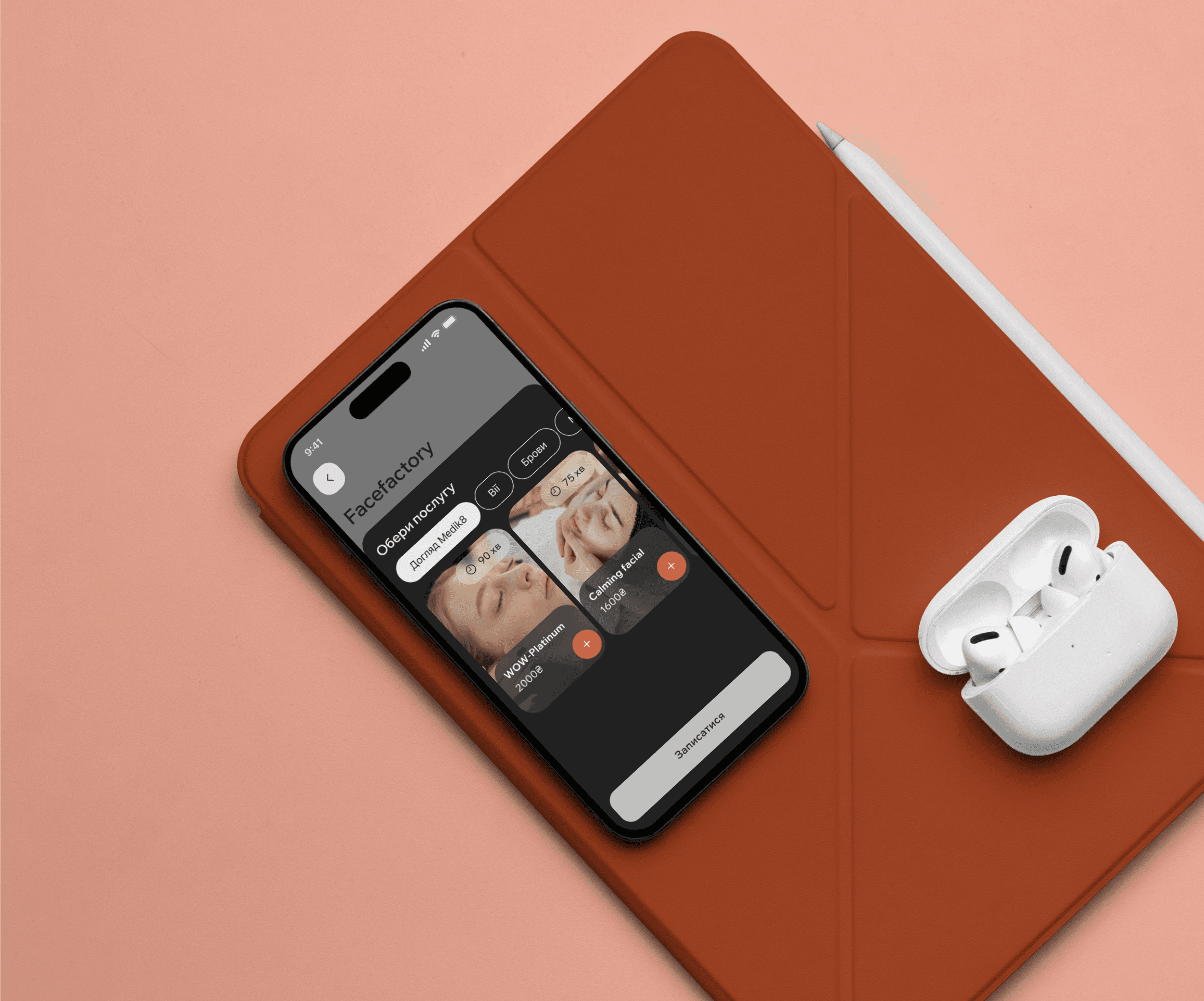
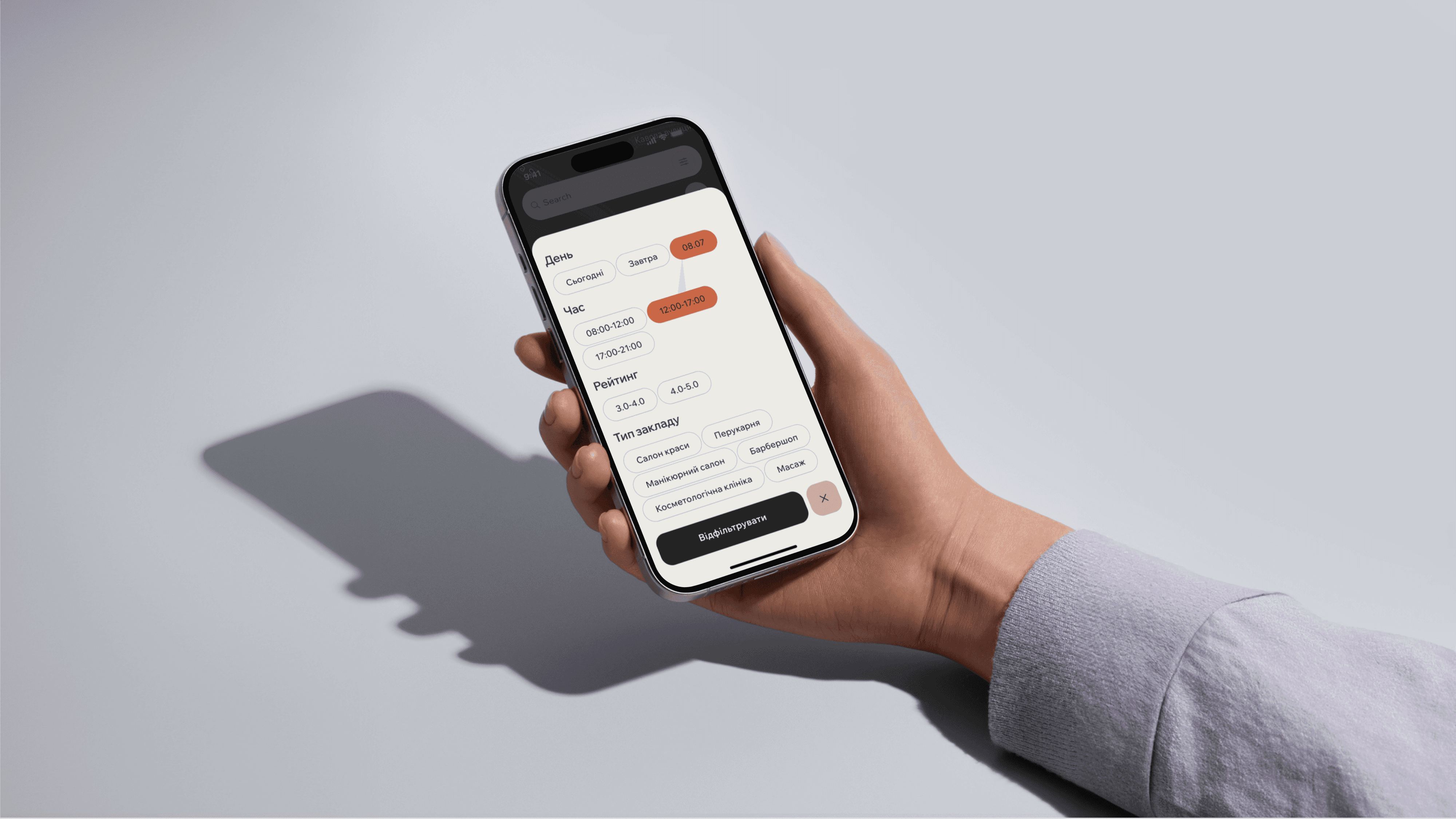
High-Fidelity Wireframes
After creating mid-fidelity wireframes and UI kit, I worked on a high-fidelity wireframes for a realistic and detailed visual representation of the final product.

Prototype
Following my wireframes, I then used Figma to create an interactive high fidelity, limited functionality prototype that I would use for usability testing.

Test Phase
During the test phase of developing the appointment app, my task was to test the design decisions I had made and to test the usability of the design.
Usability Testing
Using the high fidelity, limited functionality prototype I created, I started to test my design on users to measure its usability and identify any areas of improvement with Maze.


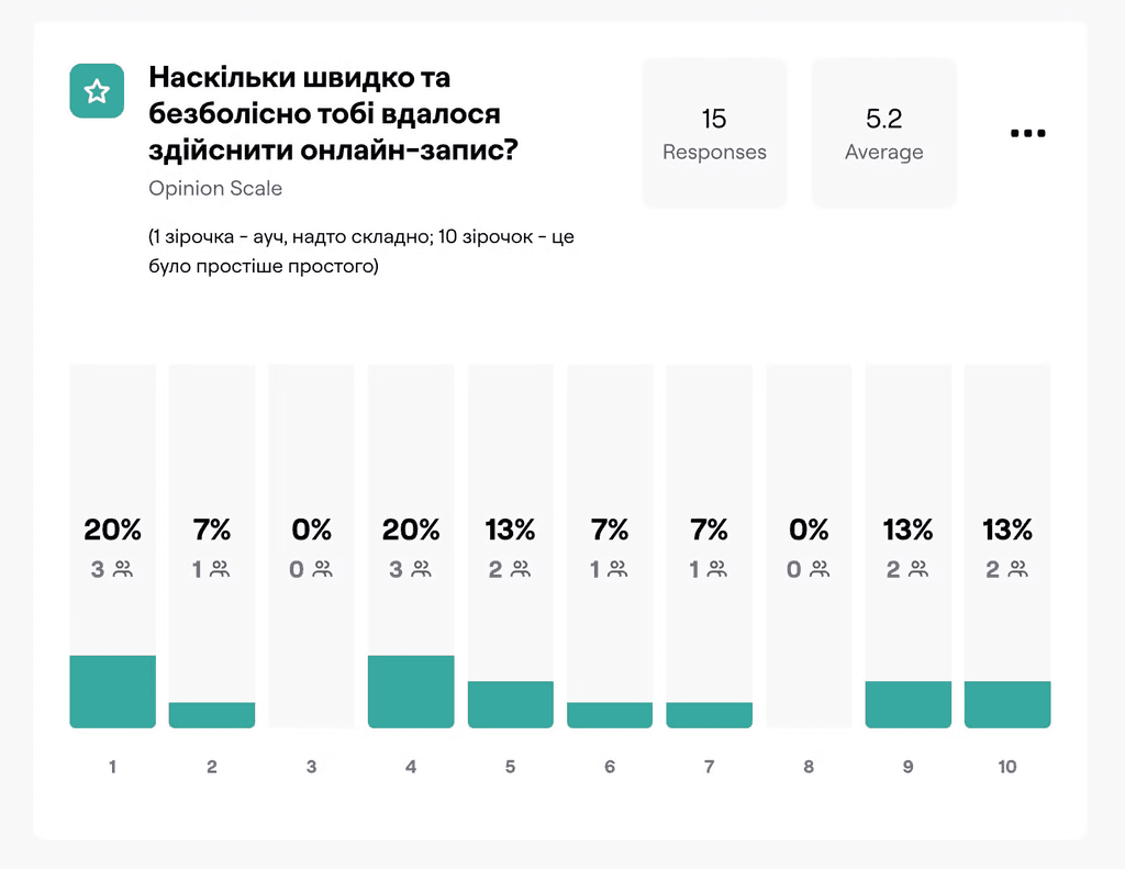

Result: I conducted a usability test on my course mates, so obtained results didn't get me a lot of useful information, as some people could be not my target audience, as some people can had prepossession, but some conclusions I managed to do.
Iteration
Heatmaps show me that users tap on the procedure on the screen with information about salon, distracting from the to-get-appointment button, so I decided to remove red button. When user tap on some popular procedure, popover with information about it opens.


As I know, users scanning the content in an "F" shape, starting from the top left corner of the page and then moving horizontally across the top section of the content.
In my project I created card with an upside down F-shaped reading pattern and it was important to know which card is better and where it is more convenient for people to read the information. Using the recommendations identified through testing ( 9 votes against 8), I left the card with an upside down F-shaped reading pattern.

Summary
The Deal project successfully delivered a user-friendly mobile app for booking beauty salon appointments. I achieved a 100% success rate in user tests, reduced distractions with optimized design, and improved navigation. Through 17 respondents A/B tests, the final design reflects user preferences, ensuring a streamlined and efficient booking experience.
2 months
of work dedicated to this project
17 respondents
passed A/B testing
80-90%
reduction in distractions after iteration