Industry
Information technology
Client
YouControl
YouControl - Enhancing User Experience

Problem
Complexity: Gradual improvements made some visual designs inconsistent and less polished. This showed the need for a visual update of the Dossier, search for a natural person, and user account.
User Onboarding Difficulties: New users found it hard to navigate the tool due to its many features and modules, making it difficult to find needed information quickly.
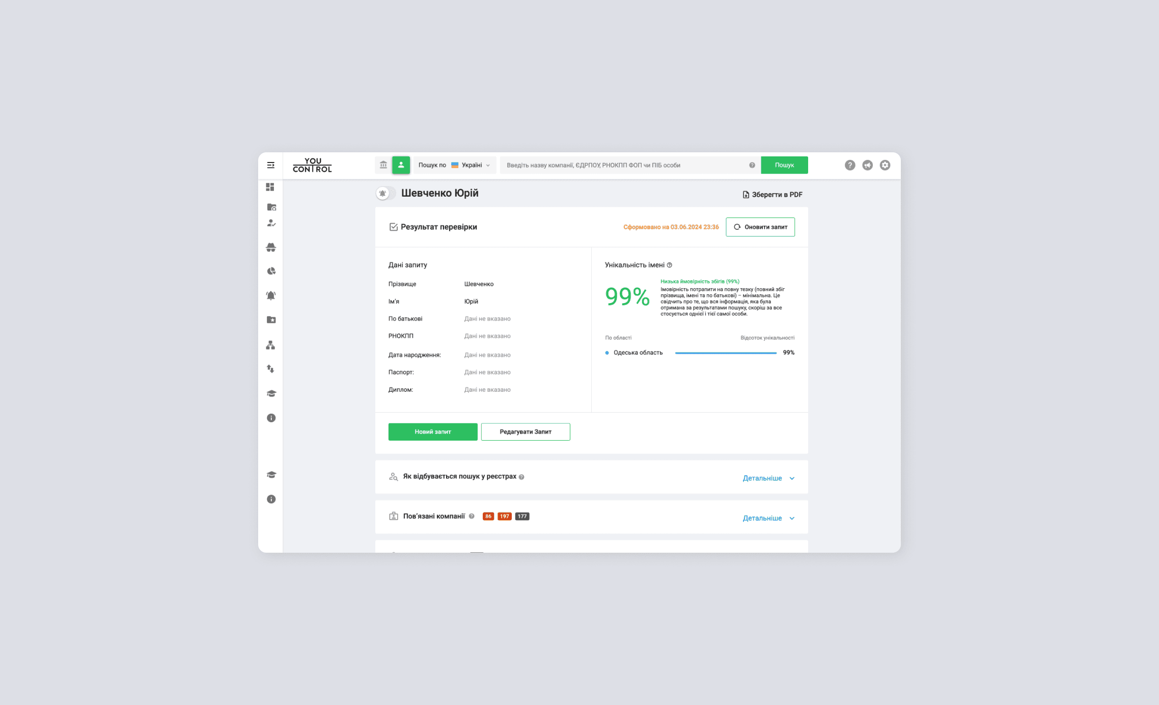
Dossier Size: The Dossier is too large, making it difficult for users to quickly find the information they want. Sharing this information in an easy-to-read format is also challenging.
Mobile Usability: Some users access the site from their mobile browsers for quick checks, which isn't very easy or efficient.
Process
The design process included briefing with clients from YouControl, auditing the existing design, forming hypotheses, working on design solutions, testing the hypotheses, and presenting the ideas.
Brief
The stakeholder meeting at YouControl showed that the user dashboard and search functions need to be improved due to usability problems. We looked at successful services to get ideas for these improvements.
The discussion also highlighted key user issues, unfinished features, and common complaints, which will help prioritize the changes to make users happier and grow the platform.

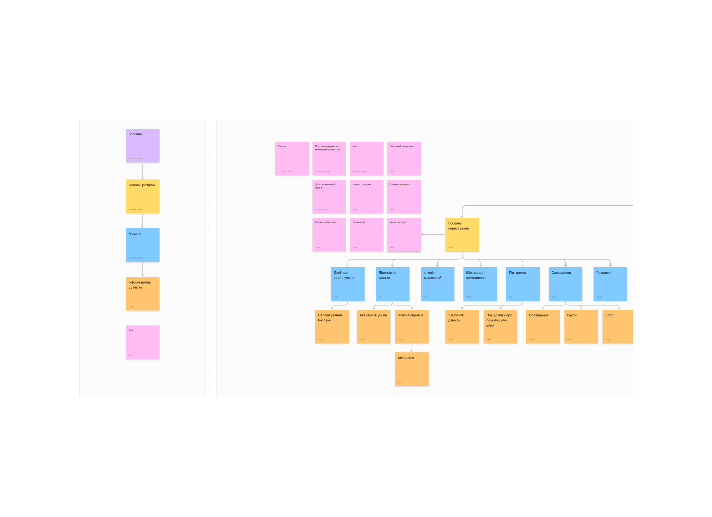
Information architecture
During our research on the YouControl website, we focused on identifying user difficulties, technical errors, and inefficiencies in performing certain functions. To thoroughly analyze the site, we decided to deconstruct it by breaking it down into individual informational entities.
This approach allowed us to carefully examine each component and then construct a comprehensive information architecture (IA) that aligns with the needs of the users and the functionality of the site.


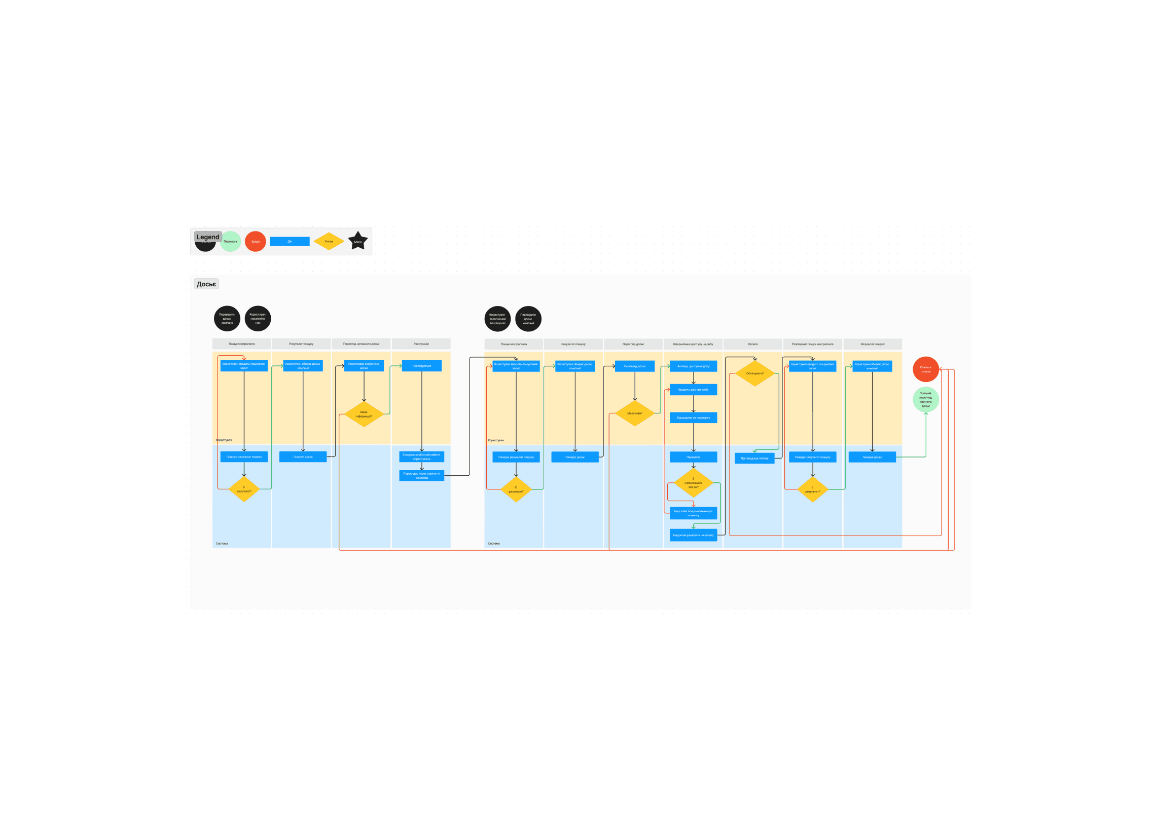
BPMN
We then took on the role of BPMN modelers, creating BPMN models to visualize the interaction processes between different roles on the YouControl website. This modeling allowed us to review how users interact with the product, helping us to identify inefficient areas and uncover opportunities for improvement.
Insights
After that, we conducted an audit of the existing design, making notes in areas that required attention and where new solutions needed to be developed.


Hypothesis 1
Pain Point: Users often miss the segment control that switches between searching for legal entities and individuals, which causes difficulties in finding the personal account.
Solution: Add categorization in the menu as a dropdown, allowing users to easily switch between individuals and legal entities, improving usability and aiding in the discovery of the personal account.

I conducted A/B testing using Maze during the process, which helped compare the effectiveness of the original design with my redesigned version.

In the first test, I focused on how easily users could find the personal account. The results showed that users struggled to locate it, as similar icons represented other sections, leading to frequent misclicks, which is evident in the heatmaps.
The next test focused on whether users used the segment control during the search. Six out of seven participants did not realize that the segment control could change the type of search target.
Result: My redesigned version was successful, as all seven users stated they would use the dropdown to switch between individuals and legal entities.
Hypothesis 2
Pain Point: Users do not understand how to navigate to the page of the desired person after getting search results for an individual. This causes confusion and hinders effective use of the platform.
Solution: The proposed solution is to prioritize displaying the "Related Sole Proprietorships" section immediately after searching for an individual. This will provide users with direct access to relevant information about the person they are looking for, reducing the number of clicks and improving usability.

Result: Testing was conducted to determine whether users could easily find the relevant sole proprietorship information after a search. The heatmaps show that users often struggle to find the necessary information, confirming the navigation issue with the current design. You can see this below:

The new design significantly improved the mission completion rate, reducing the number of users who failed to find the desired page.
Task duration also decreased, with users finding the correct information faster, indicating a 3-5 times improvement in efficiency.
Additionally, misclicks were reduced, showing a 5x improvement in click accuracy, as users were better guided to the relevant sections.

Hypothesis 3
Pain Point: The sidebar (asaid) has several issues, including unclear or unnecessary counters, poor readability of category names due to two-line text, and inefficient navigation that causes users to lose context of the current dossier.
Solution: Separate the "Company Dossier" menu from the "Main Menu" to reduce the number of items and improve navigation. Use counters to highlight important information within categories and adjust spacing to improve readability.


Result: The expected result of these changes is an improvement in user navigation and readability within the sidebar, leading to a more efficient and intuitive user experience.
Hypothesis 4
Pain Point: Users struggle to understand the full capabilities of the "Express Analysis" feature because the information is almost completely hidden. The main call-to-action (CTA) prompts users to order a consultation, which is not ideal for introverted users and requires extra effort to access information.
Solution: Display the information found by the express analysis upfront, shifting the focus towards gaining full access.


Result: Partially display the express analysis table to avoid unnecessary explanations about the feature, allowing users to see more of the content they will receive. This should make the functionality clearer and more appealing to all types of users.
Summary
During the presentation of our ideas for enhancing the user experience in the YouControl product, our clients were thrilled with the proposed solutions and confirmed that many of our hypotheses would be put into action.
1.5 months
of work dedicated to this project
10 hypotheses
were generated to solve problem
6 A/B tests
conducted to validate hypotheses
2x
increase in mission completion rate
3-5x
faster task completion
5-10x
reduction in misclicks
